So on Wednesday, the 25th of October 2023, the famous tourist destination was hit by a Hurricane of category five. From the first pictures I saw on social media, I think it is not exaggerated to say: Acapulco, a city with one million inhabitants, has been destroyed. How many people have been killed by this storm event, we don’t know yet, and I even admit I don’t want to know. Sure is only that there will be far too many that have lost their lives.
Besides this human tragedy, which is effectively not expressible by words, it is so striking how quickly this weather event developed from a tropical storm to a very dangerous storm of category five. Hence, there was almost no warning that such a disastrous landfall of a storm could happen, making everything worse for the people in this region.
What might be the reason that this storm developed within 12 hours from a tropical storm to a category five storm? Honestly, I cannot tell, I am not a climate expert. But attribution-climate researchers will be able to tell very soon what climate change has to do with this weather event. I speculate that we will see that this drastic storm had also been ‘fueled’ by El Niño. That means very likely we had an overlapping of human and natural caused weather fluctuations.
The fact is that the sea around Acapulco had an average temperature of 30-31° Celsius, which is almost one degree more than in the reference period from 1990 to 2020.
What has unfortunately very commonly not been told when discussing climate change is that the temperature of the global seas has also risen dramatically. For the past 40 years, there have also been measurements available from satellites and buoys. From this data, scientists have found that over the full period of the records, global mean sea surface temperature has increased by close to 0.9°C, and that the increase over the past four decades is about 0.6°C. So some might say, come on 0.9°C that’s not a big deal, but to increase the average water temperature of the global seas of this planet is something different from increasing the water in your kettle by one degree Celsius to make coffee or tea. As I stated in my last blog, temperature measuring is actually a measurement of kinetic energy of molecules within a fluid or gas. And on this graph from the NOAA (US Authority -National Oceanic and Atmospheric Administration-) you see how 0.9 degrees Celsius temperature increase translates into an energy increase measured by physicists in Joule.

Since these incredible high Joule numbers won’t tell too much, I asked ChatGPT to explain this diagram (Consider: Pictures are also a language, and therefore Large Language Models understand them as well)
ChatGPT 4.0
The graph you’ve provided demonstrates the ocean heat content anomaly over the past several decades. The concept of “anomaly” might sound complicated, but it simply means the difference from an average or baseline value. This chart shows how much more (or less) heat the ocean is storing compared to its historical average.
To break it down in a more understandable manner:
- Setting the Scene: Imagine the ocean as a giant bathtub. Normally, this bathtub has a certain warmth to it, which represents our average or baseline.
- The Dipping Thermometer: The chart starts in 1960 and runs to 2020. If we think of this as dipping a thermometer into our ocean bathtub over 60 years, we can see how the water’s temperature changes over time.
- Cooling and Warming: The bars below the zero line in the early years indicate that the ocean was cooler (or had less heat content) than the average. As time progresses, especially after the 1990s, the bars rise above the line, which means the ocean’s heat content has increased.
- The Spiking Thermometer: The stark rise in red bars after 1990 is similar to a fever spike in a sick person. It demonstrates that the ‘fever’ or heat of the ocean has been rising at an alarming rate in recent decades.
- A Practical Analogy: Consider a pot of water on a stove. Initially, if the flame is low, the water warms slowly. But if the flame suddenly increases (like the red bars after 1990), the water heats up much faster. The red bars represent the ocean’s rapid ‘heating’ due to increased greenhouse gases, primarily from burning fossil fuels.
- Why it Matters: A warmer ocean can have various impacts. Just like a heated pot of water starts to steam and boil, a warmer ocean can fuel more intense hurricanes and typhoons. It also leads to sea-level rise as warmer water expands. This doesn’t just affect marine life but impacts coastal cities, economies, and millions of lives around the world.
That tells us a clever machine, and the people of Acapulco will unfortunately probably confirm as well.
In addition, I want to remind you about another catastrophic ecological event which happened this year in Canada. After first estimations, about five billion trees burned down in Canada from March 2023 until now (end of October 2023). The wildfires are unfortunately until now not all ceased. These five billion burned down trees cover an area more than half of the area of Germany. Again, some people will say, Germany is not that big but five billion trees are a lot, respectively were a lot.
In the science paper “Warning of a forthcoming collapse of the Atlantic meridional overturning circulation” published in Nature Communications, this research looks at a possible collapse of the AMOC (Atlantic Meridial Overturning Circulation, the Gulf Stream is a part of that) and talks about increased autocorrelation of the AMOC. It was written by Peter Ditlevsen and Susanne Ditlevsen from the University of Copenhagen. The authors used statistical methods to detect early warning signs of a critical transition of the AMOC, based on sea surface temperatures in a region between Greenland and Great Britain. They found that temperature autocorrelation in this region has increased in recent decades, suggesting that the system is slowing down and losing its resilience. They have also given estimates for the time of the collapse to be between 2025 and 2095, with mid-century being the most likely. The article has attracted a lot of attention and been discussed in various media.
I don’t want to comment on this article now, but I intend to make a deep dive into this paper with the help of ChatGPT 4.0 because the matter requires a lot of knowledge about statistical analyses, which I have only in part. I just want to explain the term autocorrelated.
In a simplified manner, autocorrelation means that a system sticks in its current state and is less able to restore its natural “normal” state. Let’s take the example, you have just woken up, and drunk your cup of coffee and are fresh in mind. Plenty of disturbances enter now your space like e.g. colleagues, customers, family and simply everything, but you are experienced and handle all. At the end of the day, you get more and more tired and stuck in your task list, and you don’t see any progress. A statistician would call your state highly autocorrelated. So if you next time stick in your problems, tell your environment you are at present too highly autocorrelated and cannot help.
To apply the term autocorrelation to the AMOC is of course, a big mathematical challenge, but let’s see if I will be able to understand what the Danish Scientists found out.
So where is the good news?
Yes, there is some and we should not ignore them.
Let’s take a look at this diagram, and I asked ChatGPT 4.0 again to analyses it:
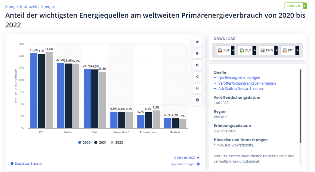
Share of the most important energy sources in global primary energy consumption from 2020 to 2022
ChatGPT 4.0
The chart you’ve presented highlights the proportion of various energy sources in global primary energy consumption from 2020 to 2022. The significance of this information, especially when discussing climate change, is immense. Here’s a breakdown:
- Oil Consumption:
- Oil remains a primary source of energy, with its share slightly decreasing from 31.3% in 2020 to 31.1% in 2021 and 31.6% in 2022. Even with technological advancements and global efforts to reduce dependence on fossil fuels, oil’s prominence as an energy source persists. This could be attributed to transportation needs and industrial applications.
- Coal:
- Coal’s contribution has shown a decline from 27.2% in 2020 to 26.9% in 2021 and further to 26.7% in 2022. This reduction might be driven by worldwide initiatives to curtail coal use due to its heavy carbon footprint and the environmental damage caused by mining.
- Natural Gas:
- Natural gas, another major fossil fuel, has seen a reduction from 24.7% in 2020 to 24.5% in 2021, but a slight increase to 25.3% in 2022. This could signify the shift of many industries from coal to gas, as gas is often touted as a ‘cleaner’ fossil fuel. Still, its rising consumption can have implications for greenhouse gas emissions.
- Hydropower:
- Hydropower remains relatively stable, from 6.9% in 2020 to 6.8% in 2021 and 6.7% in 2022. This might be due to the maturity of the technology and the geographical limitations of harnessing water for power.
- Renewables:
- The chart showcases a hopeful trend for renewables, rising from 5.7% in 2020 to 6.7% in 2021 and further to 7.5% in 2022. This indicates global efforts to shift towards cleaner energy sources. The rapid growth rate of renewables within just two years is noteworthy and aligns with the global narrative of combating climate change.
- Nuclear:
- Nuclear energy sees a decline from 4.3% in 2020 to 4.2% in 2021 and 4% in 2022. This might be attributed to safety concerns, waste disposal issues, and the high costs associated with building and maintaining nuclear power plants.
So you see, there is a little glimpse of hope in the rising of renewables but to be fair, the IEA (International Energy Agency) warns that to keep the Paris Agreement we need to rise the contribution of renewables from 7.5% to 30% until 2030:

That looks like a Mission Impossible, but I would say from a technical point of view it could work. Due to the current political conflicts with wars in Ukraine and Israel/Palestine, however, I wouldn’t bet on that.
Are renewables the last fix we can provide for the climate crises? No, they are the technology with the least side effects, but not the only technologies we should consider. And I strongly advise discussing them now and not in five years. They have a deep impact, but they also have the potential to mitigate the climate crisis effectively.
One suggestion is the CRISPER CAS9 gene editing method. With this method, you can even inherit the gene manipulation to your descendants. Scientists from this field think it can safely be done to make the digestion of cattle more effective so that they dramatically produce less Methane (NH4) during digestion.
The process of photosynthesis is a complex and intricate process, and you can consider it a time-consuming process. On a cellular level, the individual reactions involved in photosynthesis occur quite rapidly. For instance, the conversion of carbon dioxide and ribulose bisphosphate to form 3-phosphoglycerate in the Calvin cycle is a quick chemical reaction. However, for a plant to produce a noticeable amount of glucose, millions of these reactions need to take place, which can make it seem “timely” on a macroscopic scale.
Also in this matter, scientists say they are in reach of speeding up the photosyntheses. I provided some links for further details. But that these measures have deeper consequences for solving the climate crisis than the renewables approach should be obvious.
From my point of view, still the most preferable solution is to boost renewables because they are a fix with the least side effects, but if renewables don’t come to scale in time, then we should also discuss these measures.
Further links:
Hurrikan Otis – Wikipedia (German)
Hurrikan Otis – Wikipedia (English)
Erneuerbare: Ausbau schneller als geplant – DW – 06.12.2022
Statistiken zu Erneuerbaren Energien weltweit | Statista
Gen Editing: Die 5 wichtigsten Fragen zu CRISPR/Cas9 – Spektrum der Wissenschaft
Photosynthese (Fotosynthese) – Lexikon – transgen.de
So kommen Pflanzen besser mit Hitze und Trockenheit klar – quarks.de
